Across the country, administrators at college campuses have released COVID-19 dashboards, displaying metrics related to the presence of the coronavirus on their campuses. The goal of a college’s COVID-19 dashboard is transparency: it is implemented to equip students, faculty and staff with the information they need to stay aware of the COVID-19 realities on their campus.
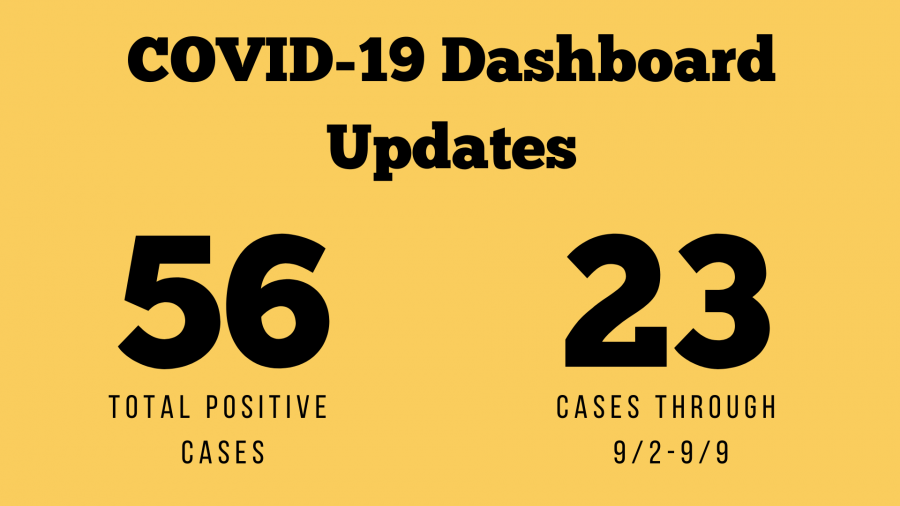
On Aug. 25, President Nathan Hatch sent a message to the Wake Forest community in which he shared the university’s dashboard. “Wake Forest’s COVID-19 dashboard will display a daily count of known, confirmed positive cases on campus,” Hatch said. On that same day, the dashboard reported a total of eight cases. Since then, the total number of confirmed cases on the dashboard has increased to 56.
The dashboard contains dates, positive cases relating to those dates, the total number of known, confirmed cases for the past 14 days and the total number of known, confirmed, positive cases since Aug. 17. As of Sept. 9, the dashboard also differentiates positive cases between faculty/staff and students. It also allows viewers to examine cases within a date range they select. There is a new FAQ section at the bottom of the dashboard, which indicates that “[s]ince beginning pre-arrival testing of students, the university has observed a 2% rate of positive cases among students tested.”
Yet, despite these updates, the dashboard is still lacking in other metrics essential to having a complete picture about the virus and its prevalence at the university. Students across campus want more information transparency on the dashboard.
Sophomore Nolan Cummings discussed the general consensus among him and his friends about the dashboard.
“[T]he COVID-19 dashboard is definitely a step in the right direction; however, it requires significantly more transparency. We would like to see the data presented in other ways than just a bar graph, such as a line graph,” Cummings said. “It would also be informative to have the positivity rates for testing, the number of tests conducted, and the disparities between those who self-reported and those randomly tested … We understand the logistical challenges Wake [Forest] faces, but greater transparency would help quell student distrust and concern.”
Information such as the total number of tests conducted would provide the Wake Forest community with a more accurate picture of the coronavirus’ presence on campus. A total case tally of 56, according to latest figures, can mean vastly different things depending on the total number of tests conducted. Identifying 56 cases out of 500 tests (the expected tally of weekly random tests as reported last week) would yield a positivity rate of 11.2%, whereas finding 56 confirmed, positive cases out of just 80 tests would present a far worrisome positivity rate of 70%.
More information, including the total number of tests conducted, is no stranger to the dashboards at other schools in North Carolina. UNC-Chapel Hill’s dashboard includes the total number of tests, the number of clusters within each residence hall and the number of students in isolation and quarantine. Duke University’s dashboard, or COVID-19 Testing Tracker, discloses not only the number of students, faculty and staff tested, but also how many of those tests were administered through random testing versus those who were symptomatic or contact-traced. In addition to reporting the number of new cases daily, Elon University’s dashboard indicates the number of estimated active cases, the number of students in quarantine/isolation and even the number of people hospitalized. The university’s decision to limit its dashboard information continues to be at odds with its peer higher education institutions.
“I definitely think they could show more and make an effort to share the information out via email or their social media on either a weekly or monthly basis for people who don’t consistently check but that should be informed,” said senior Marlee Murray.
More information, however, should be added to the dashboard soon. The new FAQ section under the dashboard states that “planned updates to the dashboard will provide the number of tests administered by the university and distinguish between tests administered to a random student population and tests administered for other reasons.” The FAQ section indicates that these updates will be implemented in mid-September. They also plan to include the approximate number of off-campus clinical tests, as well as hospitalizations.
The Old Gold & Black reached out to the Office of the President and the Division of Campus Life asking for additional information on the addition of new features to the COVID-19 dashboard, but neither party responded in time for this publication.
Sophomore Max Shenkman expressed his desire for more information about the virus’ presence on campus.
“I would really appreciate having more information,” Shenkman said. “Other schools are definitely doing a better job at being considerate to their students and telling them about what’s going on and just being clear.”
Additionally, sophomore Sarah Leary described the limited amount of information on the dashboard as “scary.”
“It just feels like we’re very in the dark,” Leary said.
Editor’s Note: The original version of this article did not mention that the Old Gold & Black contacted the Office of the President and the Division of Campus life for comment, but did not receive a response. The Sept. 10, 2020 online version reflects these changes.