Virginian Brick So Dear: Exploring the architecture of Wake Forest University and beyond
Campus architecture deserves special consideration
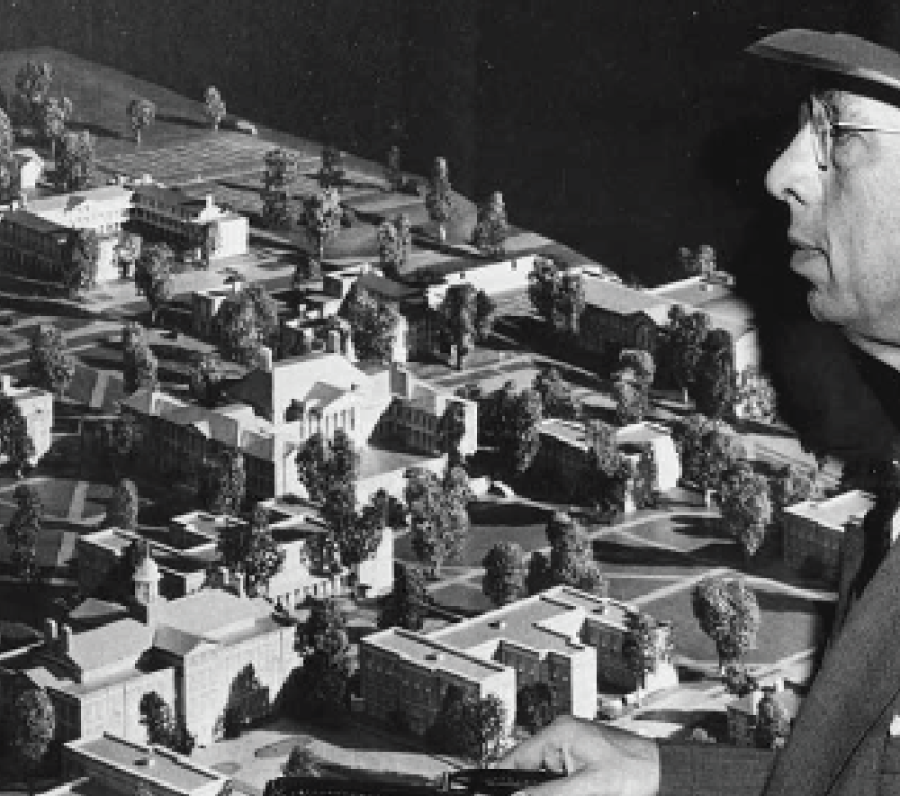
Wake Forest was designed in the 1950s, but its design makes it feel older and grander.
September 22, 2022
The long copper spire interrupts a vacant, autumnal sky. The chapel — a beaming symbol of pious religious devotion — now represents a kind of religious devotion to the liberal arts. Wait Chapel looms large over the Reynolda campus, acting as the bridge between the northern and southern campuses. It’s the centerpiece for all things Wake Forest. It’s hard to imagine Wake Forest being Wake Forest without the chapel and the magnificent Reynolda hall standing across from it. Architecture is so central to our identity and yet this rich artform goes unnoticed.
RELATED: Wake Forest was just ranked the 13th most beautiful campus by Architecture Digest.
Architecture, like any art, consists of drawing order from chaos: combining raw, disparate parts to form a new, cohesive whole. Limestone. Virginian brick. Granite. Mature Magnolia trees. These materials form the visual identity of Mother so Dear. When the university moved from Wake Forest, North Carolina to its current home in Winston Salem, the plan was to maintain the original campus’s colonial revival style while expanding its footprint. To lead the construction was architect Jens Frederick Larson who previously worked on the campuses of Colby College and Dartmouth. The seeds of Wake Forest’s neo-Georgian palette can very clearly be traced back to those two institutions as well.
Wake Forest’s campus is one of the more thoughtfully designed university campuses out there — so long as you don’t count Tribble Hall. The campus is incredibly walkable and logically laid out. One of the more obvious examples of this smart design has to be freshman housing. South campus is especially clever given that the freshman dorms are not more than five minutes from any of Wake Forest’s main academic buildings. First-year students who are likely either going out too much and/or lack a consistent sleep schedule are granted some clemency through efficient campus planning. But despite such grand design, Wake Forest suffers from a truly reprehensible accessibility problem. Though not impossible, it is extremely inconvenient to move between South and North campus without using stairs.
Wake Forest has to be commended on its architectural consistency. Almost every addition to the school since its construction in the 1950s has remained in lock-step and key with the original Georgian architecture design. Surprisingly, Benson University Center wasn’t constructed until the 1990s, and yet one would never know this due to how well its inclusion is integrated into the Tribble courtyard. This seamless architectural integration extends to the modern parts of campus as well. While the North campus residence halls are unmistakably new, the architects used them to create further visual symmetry on campus. Between Dogwood and Magnolia residence halls resides a striking view of Wait Chapel which is positioned in the middle of the two halls. This consistent artistry is pervasive in the Reynolda Campus. While Wake continues to expand and change, the intimate collegiate feel of the campus remains constant.
Architecture is so obvious and central to day-to-day life that most of the time it seems inconsequential. But in college, architecture takes on new meaning. In higher education, architecture serves a role in creating institutional iconography. For instance, when someone mentions Duke, the mental association that comes to mind is likely their gorgeous, towering, gothic chapel. It’s tantamount to a logo. Consider, for instance, the University of North Carolina’s old well, the University of Virginia’s rotunda and Berkeley’s clock tower. These architectural features generate an instant sense of place and often create an aura of prestige that mirrors that of the institution.
Campus architecture serves a more obvious, functional purpose. UNC-Chapel Hill freshman Max Nelson, a close friend of mine, once said: “College is the last place in your life where everything around you is designed for you to make friends and meet people.” Taking a moment to reflect on this profound sentiment reveals its legitimacy. Especially at schools like Wake Forest and UNC-Chapel Hill, where prominent green spaces are communal incubators, designed for students to engage and socialize. While “effective urban planning and adequate green areas” is typically a lower-tier consideration — if it is even a consideration at all — when choosing colleges, maybe we ought to put more emphasis on it. Does Georgetown, with its Jesuit verticality, have the same social capacity as another school with a primary quad space? Are New York University kids more isolated because of a lack of a centralized campus? These questions speak to the heart of urban planning and invite us to think harder about the environment around us. It’s not often that we consciously stop and think about how the spaces we inhabit influence our social behavior. For this reason alone, college campuses are some of the most remarkably designed spaces in which we will partake in our lifetime. They are meant to not only foster academic studiousness but also create social lives and interpersonal relationships among the student body. As such, the thoughtfulness of a college’s design has a measurable impact on the life and interactions of students. We are lucky to have a beautiful and thoughtfully designed campus. One that celebrates natural beauty and collegiate tradition. And above all else, one with beautiful wide-open quads.


Max • Sep 22, 2022 at 12:42 pm
Incredible article, this guy needs a promotion